Loyola University Chicago Template 4.0
Documentation
The Web Pattern Library is a resource developed to showcase the different templates and patterns used by the University to display content. This section of documentation provides insight and guidance for implementing best practices in use. If you would like information on how to incorporate these patterns into your site please contact DigitalTeam@luc.edu.
Formatting in T4 - Headlines, Paragraphs, Lists, and Images
Using the Formatter - WYSIWYG
Images
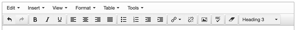
T4: Insert an image using the media button in the toolbar.
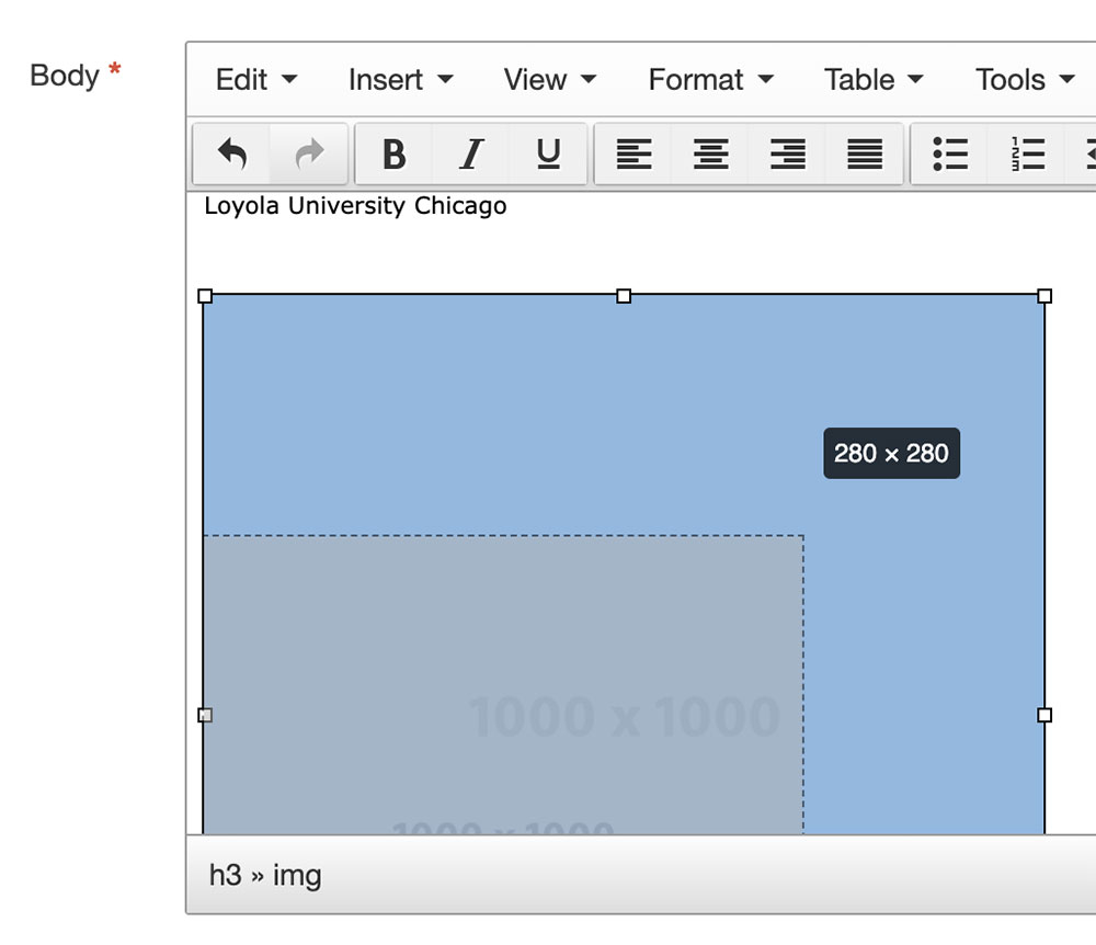

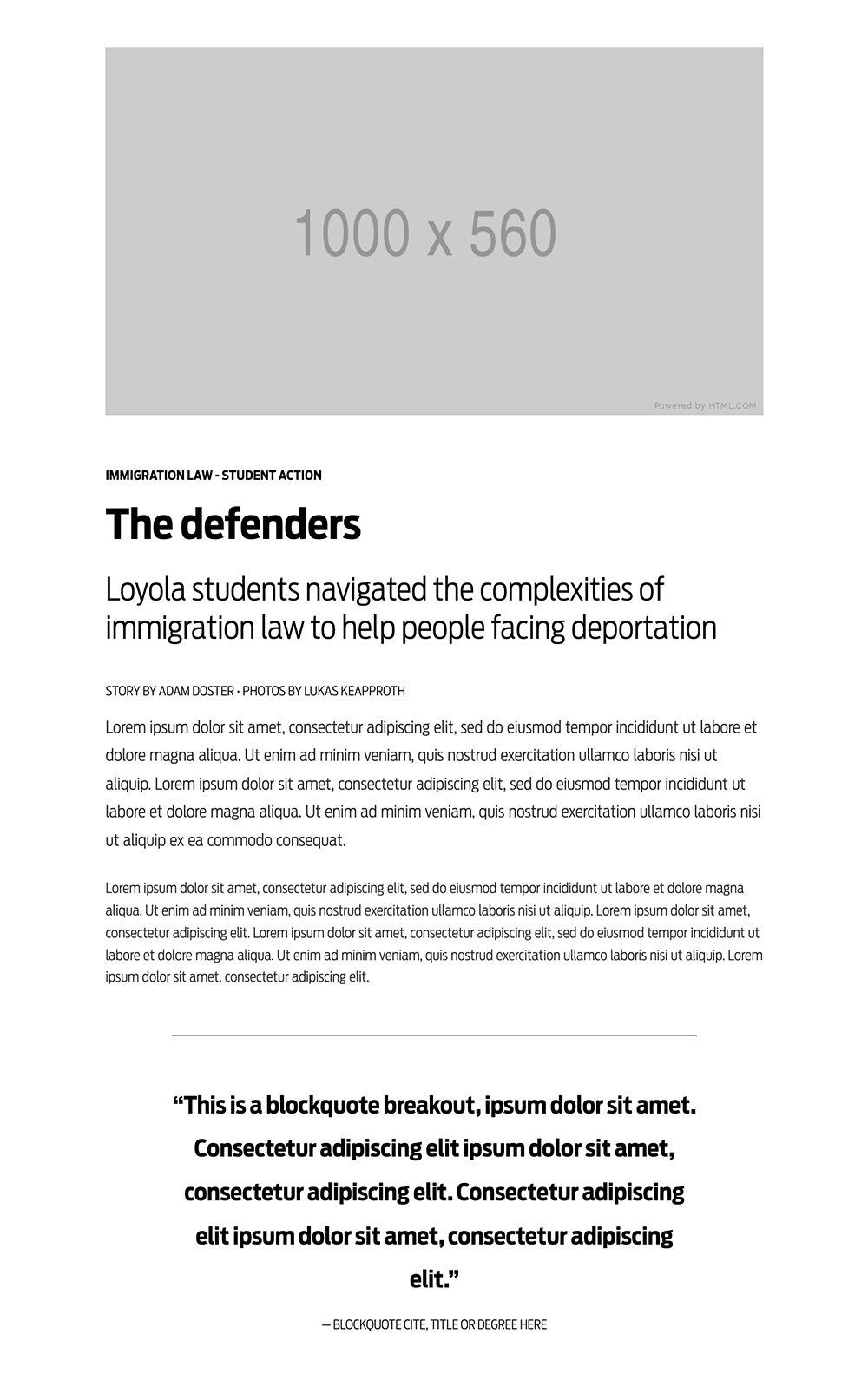
1
T4:Images: Once the image is in place, reisize the image by selecting the image. Using one of the four corner anchors decrease or increase the size of the image according to the following guidelines.
Horizontal images can and will fill the width of the container. Most often a 16:9 acpect ration image is used. An example of this format is a widescreen television screen.
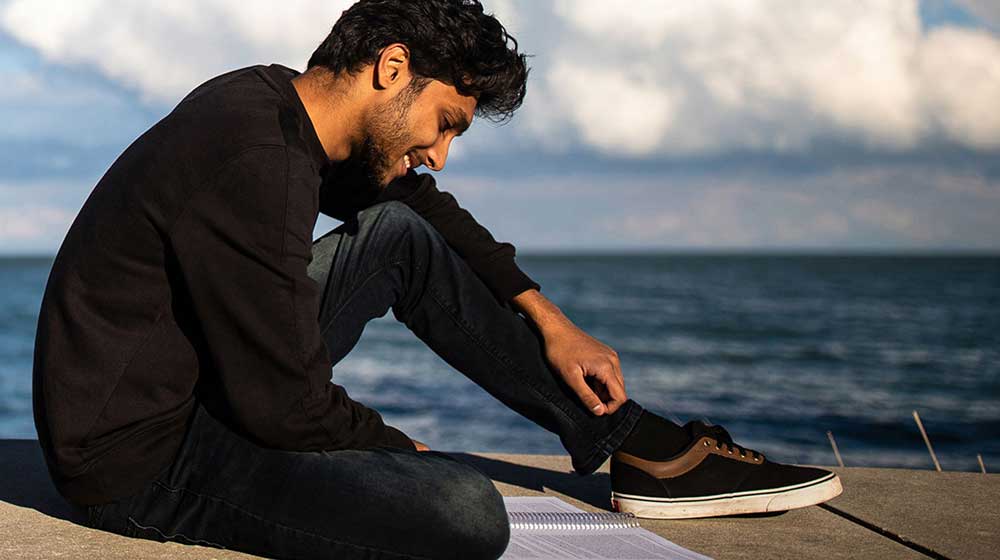
Vertical images will often seem oversized when the full width of the container. A width to begin with is 50% of the container.
Portrait images if tightly cropped as a head and shoulders image, should not fill the width of the container but should be resized to a 280 pixel width.
Typography - Headlines, Paragraphs, Lists, Infobox, Numbers, Blockquotes, and Buttons
Examples and best practices
 EXAMPLE - Content
 EXAMPLE - Story
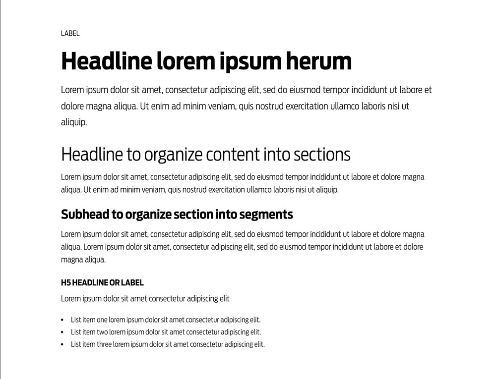
Headlines
H1 hedgeline used as a first-level page or story headline
H2 headline used as a first-level headline combined with h1
Lorem ipsum dolor sit amet, consectetur strong tag here elit. Etiam gravida leo massa, at elementum orci consequat non. Vestibulum quis sapien metus. Nam porta est in metus imperdiet, nec finibus enim viverra. Ut ultricies orci vel dapibus pharetra. Morbi in purus id erat sollicitudin pulvinar. Link
Lorem ipsum dolor sit amet, consectetur adipiscing elit. Etiam gravida leo massa, at elementum orci consequat non. Vestibulum quis sapien metus. Nam porta est in metus imperdiet, nec finibus vel magna pharetra enim viverra. Ut ultricies orci vel dapibus pharetra. Morbi in purus id erat sollicitudin pulvinar. Link
H2 headline used as a first-level headline
Lorem ipsum dolor sit amet, consectetur adipiscing elit. Curabitur nec posuere odio. Phasellus odio lectus, ultrices non pretium ac, mollis id elit. Fusce tempor tellus non felis tempus vestibulum. Donec molestie purus sem guspendisse at placerat turpis. Duis luctus erat vel magna pharetra aliquet. Maecenas tincidunt feugiat ultricies. Phasellus et dui risus. Vestibulum adipiscing, eros quis lobortis dictum.
This is a Section Label
H3 hedgeline used as a second-level headline
Lorem ipsum dolor sit amet, consectetur adipiscing elit. Curabitur nec posuere odio. Phasellus odio lectus, ultrices non pretium ac, mollis id elit. Fusce tempor tellus non felis tempus vestibulum. Donec molestie purus sem. Suspendisse at placerat turpis. Duis luctus erat vel magna pharetra aliquet. Maecenas tincidunt feugiat ultricies. Phasellus et dui risus. Vestibulum adipiscing, eros quis lobortis dictum.
H4 hedgeline used as a subhead
Lorem ipsum dolor sit amet, consectetur adipiscing elit. Curabitur nec posuere odio. Phasellus odio lectus, ultrices non pretium ac, mollis id elit. Fusce tempor tellus non felis tempus vestibulum. Donec molestie purus sem. Suspendisse at placerat turpis. Duis luctus erat vel magna pharetra aliquet. Maecenas tincidunt feugiat ultricies. Phasellus et dui risus. Vestibulum adipiscing, eros quis lobortis dictum.
H5 used as a headline or label
Lorem ipsum dolor sit amet, consectetur adipiscing elit.
- List item one lorem ipsum dolor sit amet consectetur adipiscing elit.
- List item one lorem ipsum dolor sit amet consectetur adipiscing elit.
- List item one lorem ipsum dolor sit amet consectetur adipiscing elit.
H6 used as a category
Lorem ipsum dolor sit amet, suspendisse at placerat turpis. Duis luctus erat vel magna pharetra aliquet.
Body styles
Paragraphs
This is an intro paragraph body. Consectetur link here adipiscing elit. Curabitur nec info color posuere odio. Phasellus odio lectus, ultrices non pretium success color ac, mollis id elit. Fusce tempor tellus non felis tempus vestibulum. Donec molestie warning color purus sem. Suspendisse at placerat turpis. Duis luctus erat vel magna pharetra aliquet. Maecenas danger color tincidunt feugiat ultricies. Phasellus et dui risus. Vestibulum adipiscing, eros quis lobortis dictum.
This is standard paragraph body. Consectetur link here adipiscing elit. Curabitur nec info color posuere odio. Phasellus odio lectus, ultrices non pretium success color ac, mollis id elit. Fusce tempor tellus non felis tempus vestibulum. Donec molestie warning color purus sem. Suspendisse at placerat turpis. Duis luctus erat vel magna pharetra aliquet. Maecenas danger color tincidunt feugiat ultricies. Phasellus et dui risus. Vestibulum adipiscing, eros quis lobortis dictum.
This is paragraph body. Consectetur link here adipiscing elit. Curabitur nec info color posuere odio. Phasellus odio lectus, ultrices non pretium.
Lists
Unordered Lists
- List item one lorem ipsum dolor sit amet consectetur adipiscing elit.
- List item two lorem ipsum dolor sit amet consectetur adipiscing elit.
- List item three lorem ipsum dolor sit amet consectetur adipiscing elit.
Unordered Lists - Nested Lists
- List item one lorem ipsum dolor sit amet consectetur adipiscing elit.
- List item two lorem ipsum dolor sit amet consectetur adipiscing elit.
- List item one lorem ipsum.
- List item two lorem.
- List item three lorem ipsum.
- List item three lorem ipsum dolor sit amet consectetur adipiscing elit.
- List item one lorem ipsum.
- List item two lorem.
- List item three lorem ipsum.
Ordered Lists
- List item one lorem ipsum dolor sit amet consectetur adipiscing elit.
- List item two lorem ipsum dolor sit amet consectetur adipiscing elit.
- List item three lorem ipsum dolor sit amet consectetur adipiscing elit.
Ordered Lists - Nested Lists
- List item one lorem ipsum dolor sit amet consectetur adipiscing elit.
- List item two lorem ipsum dolor sit amet consectetur adipiscing elit.
- List item one lorem ipsum.
- List item two lorem.
- List item three lorem ipsum.
- List item three lorem ipsum dolor sit amet consectetur adipiscing elit.
- List item one lorem ipsum.
- List item two lorem.
- List item three lorem ipsum.
Stylized ordered list
- List item one explainer readout lorem ipsum dolor sit amet consectetur adipiscing elit.
- List item two explainer readout lorem ipsum dolor sit amet consectetur adipiscing elit.
- List item three explainer readout lorem ipsum dolor sit amet consectetur adipiscing elit.
Infobox
Heading
This is paragraph body. Consectetur link here adipiscing elit. Curabitur nec info color posuere odio. Phasellus odio lectus, ultrices non pretium success color ac, mollis id elit. Fusce tempor tellus non felis tempus vestibulum. Donec molestie warning color purus sem. Suspendisse at placerat turpis. Duis luctus erat vel magna pharetra aliquet. Maecenas danger color tincidunt feugiat ultricies. Phasellus et dui risus. Vestibulum adipiscing, eros quis lobortis dictum.
- List item lorem ipsum here.
- List item lorem here enim ad minim veniam.
- List item lorem ipsum here.
- List item lorem here.
Numbers
010
Readout number description
010
Readout number description
010
Readout number description
010
Readout number description
Footnote and Details
Details - Use a decsriptive headline
Phasellus odio lectus, ultrices non pretium ac, mollis id elit. Lorem ipsum dolor sit amet, consectetur adipiscing elit, sed do eiusmod tempor incididunt ut labore et dolore magna aliqua. Ut enim ad minim veniam, quis nostrud exercitation ullamco laboris nisi ut aliquip ex ea commodo consequat.
Lorem ipsum dolor sit amet, consectetur adipiscing elit, sed do eiusmod tempor incididunt ut labore et dolore magna aliqua. Ut enim ad minim veniam, quis nostrud exercitation ullamco laboris nisi ut aliquip.
- List item one lorem ipsum dolor sit amet consectetur adipiscing elit.
- List item two lorem ipsum dolor sit amet consectetur adipiscing elit.
- List item three lorem ipsum dolor sit amet consectetur adipiscing elit.
Blockquotes
“This is a blockquote breakout, ipsum dolor sit amet. Consectetur adipiscing elit ipsum dolor sit amet, consectetur adipiscing elit. Consectetur adipiscing elit ipsum dolor sit amet, consectetur adipiscing elit.” Blockquote cite, CEO, Link here
“This is a blockquote breakout, ipsum dolor sit amet. Consectetur adipiscing elit ipsum dolor sit amet, consectetur adipiscing elit. Consectetur adipiscing elit ipsum dolor sit amet, consectetur adipiscing elit.” Blockquote cite, CEO, Link here
“This is a blockquote breakout, ipsum dolor sit amet.” Blockquote cite, CEO, Link here
Buttons
Images - Standard Sizes and Aspect Ratio
The most common standard image sizes.
1000px x 560px
Aspect Ratio: 16:9.
Note: the focal point - the sublect's face - is near the horizontal center of the image. This is best pratice for mobile display.

1000px x 1000px
Aspect Ratio: 1:1

1000px x 1000px - Portrait
Aspect Ratio: 1:1.
Note: the cropped image includes the subject's head and shoulders.
Images - Hero Sizes and Aspect Ratio
The most common hero image sizes.
Note: The focal point is at or near the horizontal center of the image. This is best pratice for mobile display.
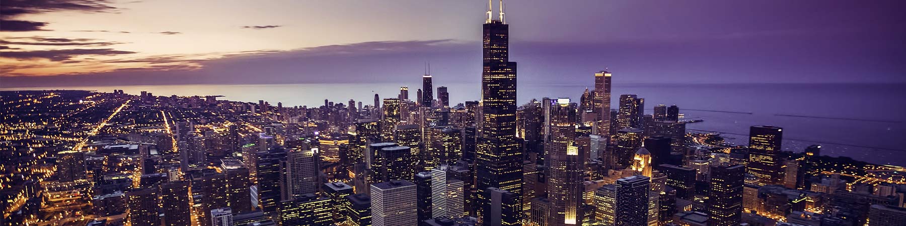
1800px x 450px
Aspect Ratio: 16:4.
Note: This hero image size is used as a standalone without text.
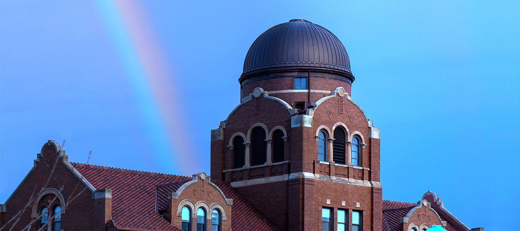
1800px x 800px
Aspect Ratio: 16:7

1800px x 1000px
Aspect Ratio: 16:9.
Images - Optimization, saving for web
The primary goal of formatting your images is to find the balance between the lowest file size (weight) and an acceptable quality.
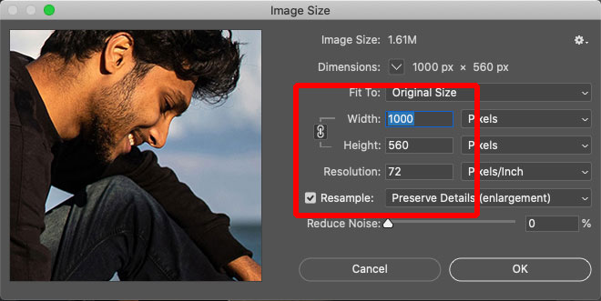
Step 1: Size the image
Crop and set your image size. At this stage, you can also set the resolution to 72dpi. You will see the new image size displayed at the top of the dialog box. See typical image sizes
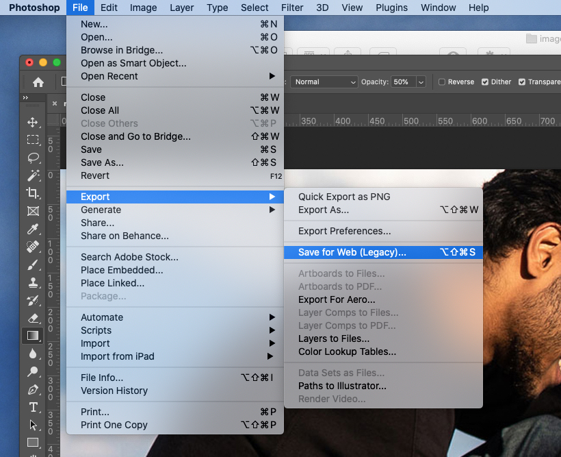
Step 2: Export the image
To begin the optimization steps, select File > Export > Save for web. See above.
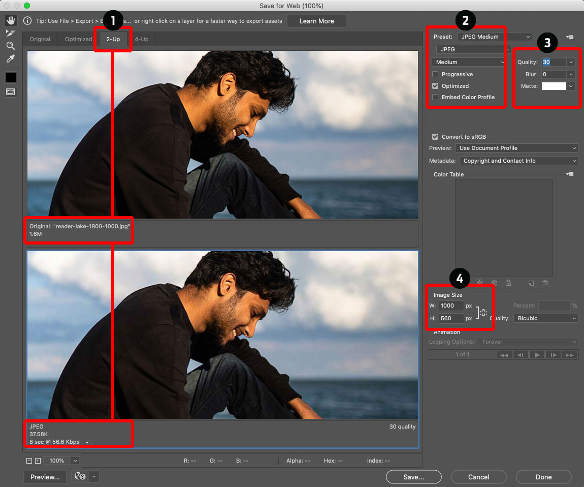
Step 3: Optimize the image
1Select the 2-Up tab. This allows you to preview and compare the weight and quality of the original and optimized versions of the image.
2Select a built-in JPG medium or JPG high preset. You can also adjust all of these settings manually.
3The quality can also be manually adjusted. Try different settings to get the lightest image file without compromising the quality too much.
4If you haven’t set the width to the chosen format, you can set it now. This is important as it will produce the lightest file size possible. Keep the W and H linked.
Important: It’s a good practice to keep the original version of your image and not write over it when saving your optimized image.
Images - Resizing for Mobile
It's essential to take the time to manage the image display on mobile devices. Resizing classes are for phones in portrait orientation. The combination of two classes control the display by changing the size and position of the image within its container.
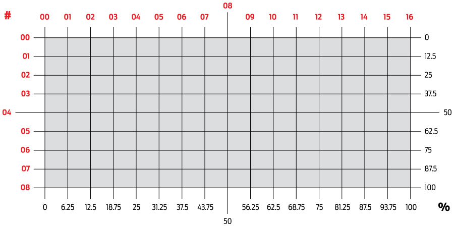
Image resize Understanding the grid
There are sixteen horizontal increments and eight vertical increments. The red numbers identify the horzontal grid lines 00 through 16 and the vertical grid lines 00 through 08.

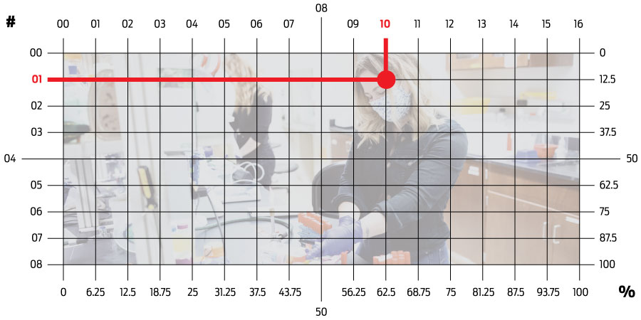
Image resize Identifying the focal point
In this case the student's face is the focal point. Notice the grid lines intersect at the 10 and 01.

Image resize Adding classes for mobile display
Three attributes are controlled by three sets of classes. The attributes are container height, image size, and image position.
In this case, the three added classes are hero-wrapper-height-100, enlarge-200, and horizontal-10-vertical-01
Wrapper class
This group of classes control the height of the wrapper in 15% inrements from 25% to 300% and 25% increments from 400% to 600%. The class is written in the pattern of the following examples.
In the example above, using the class hero-wrapper-height-100, the height of the wrapper is 100% or 1:1.
- hero-wrapper-height-25 = 25% - 4:1
- hero-wrapper-height-50 = 50% - 4:2 or 2:1
- hero-wrapper-height-75 = 75% - 4:3
- hero-wrapper-height-100 = 100% - 4:4 or 1:1
- hero-wrapper-height-125 = 125% - 4:5
Enlarge class
This group of classes control the size of the image in 25% inrements from 100% to 1000%. If the image is 100%, the width of the image is equal to the width of the screen. The class is written in the pattern of the following examples.
In the example above using the class enlarge-200, the image is twice the width of the screen.
- enlarge-100 = 100%
- enlarge-125 = 125%
- enlarge-150 = 150%
- enlarge-175 = 175%
- enlarge-200 = 200%
Position classes
These two groups of classes control the position of the image. The class name is derived from where the horzontal and vertical grid lines intersect. The class name always begins with the horizontal grid line, horizontal-10 in this example, followed by the corresponding vertical grid line, vertical-01 in this example.
In this example, the complete class is horizontal-10-vertical-01. Notice the hyphen between the classes.
There are 16 horzontal classes in increments of 01 - horizontal-00 through horizontal-16. The class is written in the pattern of the following examples.
- horizontal-00
- horizontal-02
- horizontal-02
- horizontal-03
- horizontal-04
There are 8 vertical classes in increments of 01 - vertical-00 through vertical-08. The class is written in the pattern of the following examples.
- vertical-00
- vertical-02
- vertical-02
- vertical-03
- vertical-04
The two classes - one from horizontal group and one from the vertical group - are always combined with a hyphen to make one class name, horizontal-10-vertical-01 for example.
Cards - Using the elements of a card
Element names in bold corrolate to Terminal Four input field labels
20/0/0000: 0:00PM-0:00PM
3The headline is lorem ipsum
4Somebody Namehere
Lorem ipsum dolor sit amet
6Lorem ipsum dolor sit amet, consectetur adipiscing elit. Etiam gravida leo massa, at elementum orci consequat non. Lorem ipsum dolor sit amet, consectetur adipiscing elit. Etiam gravida leo massa, at elementum orci consequat non.
9Lorem ipsum unum
Follow best practice guidance. Word counts are strongly suggested.
- Image - One of two image sizes can be used. 1000px x 560px and 1000px x 1000px.
For more information about images, see images documentation - Label - Short label to add context, or the date of an event
- Title - Brief 5-8 word headline or title
- Identifier - Person or subject
- Explainer - Title or subline
- Readout - Brief 10-30 word paragraph.
- Link - Brief "Call to Action" - For example, READ MORE.
- Button - Brief "Call to Action" - For example, REGISTER NOW.
- Button Readout - Brief 3-5 word readout. For example,
Cards - 5 Variations
Element names in bold italic corrolate to Terminal Four checkboxes
1 Card Standard
T4: This is the standard display.
See LEARN T4 below for details.

2 Card With Panel
T4: Select Default Card Display.
See LEARN T4 below for details.

3 Card With Overlay
T4: Select Display Image Overlay.
See LEARN T4 below for details.

4 Card Horizontal
T4: Select Display Card Items Horizontally.
See LEARN T4 below for details.

5 Card Circle Image
T4: Select Display Circle Image.
See LEARN T4 below for details.


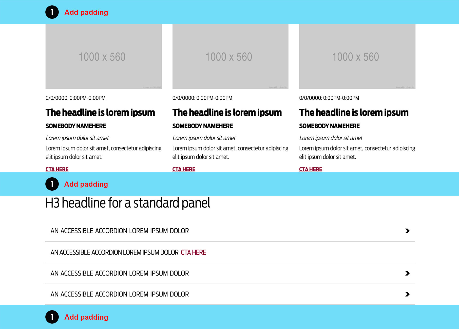
Padding - Sizes, placement, and backgrounds
Three ways to use padding with panels.

Standard padding
Padding is placed at the top and bottom of panels. Adjacent panels share padding when they share the same background color.
See LEARN T4 below for details.

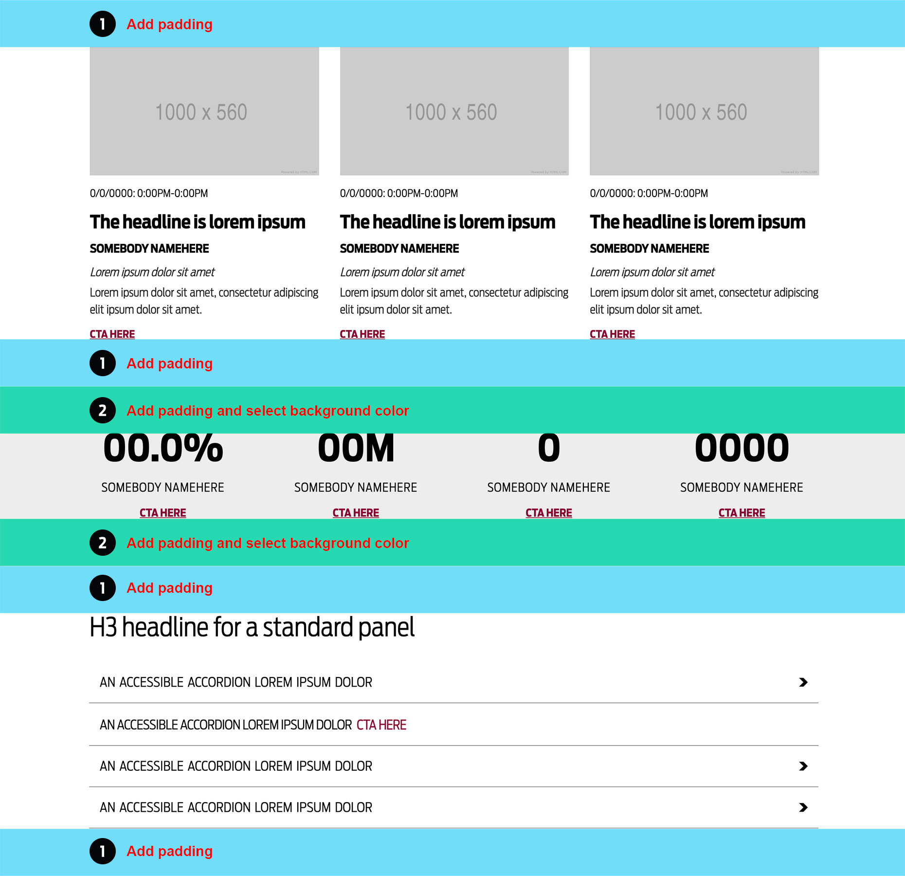
Alternating padding
Padding is placed at the top and bottom of panels.
See LEARN T4 below for details.

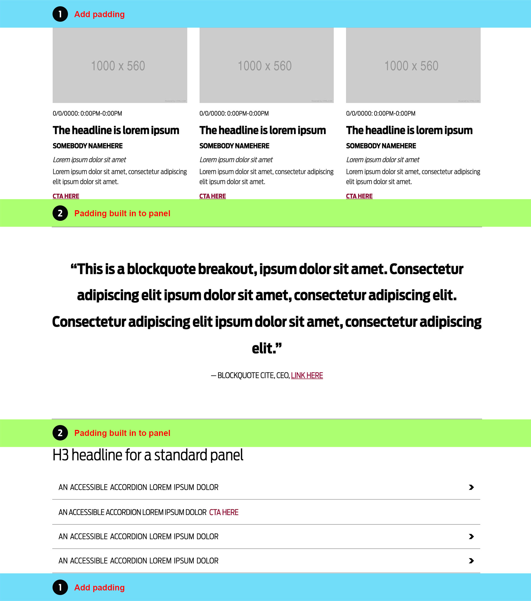
Built-in padding
Some panels - blockquote for instance - have built in padding.
See LEARN T4 below for details.
PADDING SIZES - Available padding sizes are Extra Small, Small, Medium, and Large.
PADDING EXTRA SMALL AND SMALL - Padding Small and Padding Extra Small are most often used as needed to separate content pieces. For example, between Universal Header and Page Content Only.
BACKGROUND COLORS - Available background colors are White, Gold, Gray, Maroon, and Terracotta. Default background is white and most commonly used backgrounds are white and gray.
Panels
Panels - General
Panel - Hero Image

Direction and Guidance
Usage - Standalone image usually positioned at the top of a page.
1Image - Use a simple image with a centered focal point for mobile. Format: 1800px x 450px - 16:4.
Panels - General
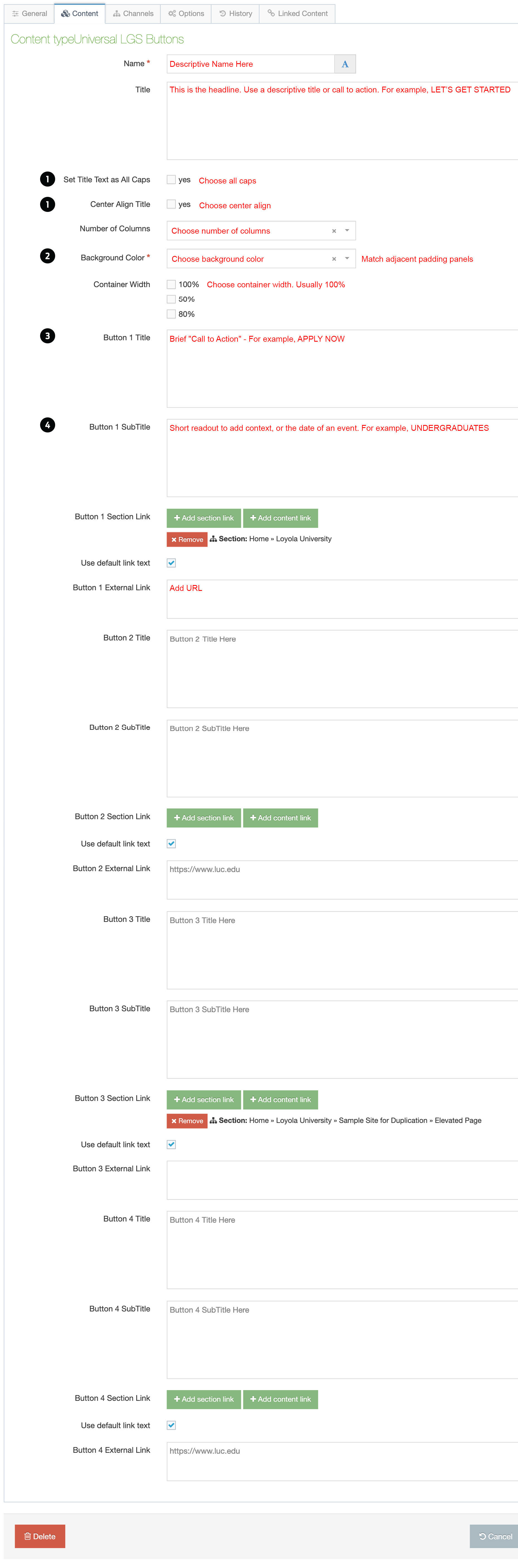
Panel - LGS Buttons

Direction and Guidance
Usage - Direct targeted audiences to specific content.
1Headline - Use a simple descriptive label - OUR COMMUNITY or call to action - LET'S GET STARTED.
2Padding and Background - Combine with padding content type above and below LGS Buttons panel. Background color must match adjacent padding panels.
3Button - Use a short, specific CTA. For example, REGISTER NOW or READ JANE DOE’S STORY.
4Button Readout - Adds context to the CTA. For example, CTA: REGISTER NOW / Readout: DEADLINE: 00/00/0000.
Panels - Image Combinations
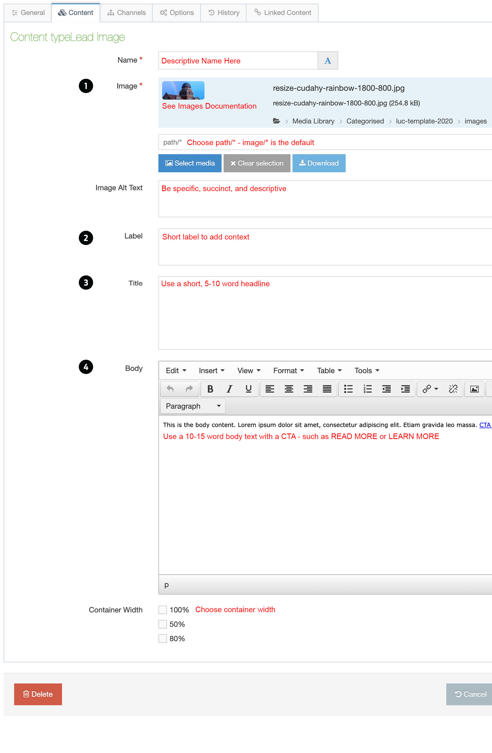
Panel - Lead Image

Direction and Guidance
Usage - Link to a timely story or content.
1Images - Use simple images with centered focal point for mobile. Formats: 1000px x 800px - 16:7 or 1800px x 1000px - 16:9.
2Label - Use a short label to add context.
3Headline - Use a short 5-10 word headline.
4Text and CTA - Use a short 10-15 word line of text with a CTA. The CTA is not required. Image Lead can be a standalone.